New York Times takes a look at 4 public spaces with Fred Kent
Fred Kent, the founder and president of the Project for Public Spaces, recently took a look at four New York spaces with Elizabeth Giddens of The New York Times. Mr. Kent gave her his ideas on why some work and some don't. For those of you who were able to attend the “placemaking” workshop Mr. Kent led on the Memphis riverfront in March, it’s a reminder of several of the basic principles we learned. And for all of us, it’s a quick summary of a few essential elements that help make great public places.

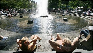
Washington Square Park
A NOD “Almost perfect,” Fred Kent says about the park, where visitors to its main fountain are both audience and spectacle.
The scene around the central fountain of Washington Square Park was so enthralling on an August day that the people with books on their laps weren’t even bothering to read them. The magic lay not in street performers but in the scores of people draped around the fountain’s stepped bowl. They served as both audience and spectacle, participating in a quintessential urban pleasure, people-watching.
“I’ve been coming to this park nearly every week for 10 years, and I’ve never gotten tired of it,” Mr. Kent said. “It’s almost perfect.”
But not quite.
“Watch,” he whispered, his crescent-shaped eyes crinkling with delight. “People will tell you exactly how to improve a place, just by their actions.”
Mr. Kent immediately noticed that several people had squeezed themselves into a narrow no man’s land, sandwiched between the backs of the benches and the plants that ring the dog park.
“Clearly, people want to look at the dogs,” Mr. Kent said. “So why not arrange the benches and move the hedges in a way that allows them to do that?”
He next remarked on the huge crowd around the cart that was selling dosas, a South Indian crepe, at the park’s southwest border. The crowd is there because the dosa man makes delicious and inexpensive dosas, but also because people especially like to eat in parks. But to Mr. Kent’s consternation, in most New York parks, including this one, the options for buying food are few or none.
“I would put in two or three clusters of ethnic food carts, surrounded by some tables and chairs,” Mr. Kent said. “Or even a little cafe-restaurant in the red brick buildings that the Parks Department uses for storage.”
Food kiosks, to Mr. Kent’s mind, are among the most appealing destinations a place can feature — accessible fountains are another — and appealing destinations are the backbone of his prescriptions for public spaces. The logic is simple: Destinations attract people, and, as Whyte put it, “what attracts people most, it would appear, is other people.”
That would explain the crowds clustered around the fountain, even when it’s dry.
What Mr. Kent would not do is move the fountain so that it is in line with the arch, an arrangement that is planned as part of the park’s coming $16 million renovation and will mostly please symmetry-obsessed aerial photographers.
Nor would he replace the U-shaped ledges that protrude into the central circle around the fountain, something the plans also call for. He would keep them because people obviously like them. The ledges are invariably covered with sitters because their design, quite by accident, allows for flexible and varied social arrangements. One of the nine ledges was just then comfortably accommodating two people playing guitars, a couple engaged in an animated discussion, and a solitary sunbather.

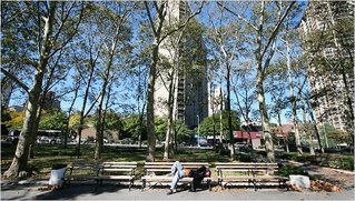
Brooklyn Borough Hall
A NO To perk up these deserted parks, Mr. Kent prescribes food carts, art stalls and crafts tables.
Planners have long been keen to use parks to keep the city at bay, to provide a retreat from urban bustle. This perspective has led to some undeniably great places, such as Central Park and Prospect Park, but to Mr. Kent’s mind, it has also limited an understanding of the potential of public spaces.
Case in point: the parks north of Brooklyn Borough Hall. These parks, which stretch from the front of Borough Hall almost all the way to the Brooklyn Bridge and the East River, constitute a nearly continuous greenbelt, a 150-yard-wide, half-mile-long swath of trees, grass and benches — in theory, a perfect oasis from the hubbub of downtown Brooklyn.
The trouble is, the space is generally deserted. On a cloudless late-summer day, the only people using the parks were the half-dozen homeless men sprawled across its benches.
According to Mr. Kent, this is because, with few exceptions, the passive enjoyment of trees is generally not enough to attract a broad range of users.
That leads to one of his favorite axioms: “What people say they do and what they actually do are often two totally different things.” What they say they do is seek refuge from the city in quiet places where they can “get away from it all.” What they actually do is seek out the lively places, full of people and activities, “not to escape the city,” as Whyte observed, “but to partake of it.”
When Mr. Kent looks at the scraggly, unused string of parks, he sees the opportunity for something like the Ramblas in Barcelona — a long, bustling market dotted with produce stands, ethnic food carts, booksellers and craft tables, and interspersed with and surrounded by green spaces.
“You could draw on the borough’s strengths and have art stalls run by local galleries and the Brooklyn Museum,” Mr. Kent said, gesturing at his imaginary agora, “and plant and flower stands run by local nurseries and the Brooklyn Botanic Garden.”
The market could tumble north, punctuated with foosball tables, swing sets, gardens and performance spaces, and connect, via a small sky bridge, to the Brooklyn Bridge walkway, so that bikers and pedestrians from Manhattan would be pulled into a lively, interesting space that displayed Brooklyn in all its glory. Such a space could run along Old Fulton Street right down to the water, leading thousands of happy promenaders to the middle of the planned Brooklyn Bridge Park.
“This could be the best approach to the waterfront in the United States,” Mr. Kent said. “Brooklyn could be defined by this space.”
And the price tag? Mr. Kent put it at less than $2 million — petty cash in development terms — and rents from the markets could ensure that the project would pay for itself in a few years.
“Sometimes the very fact that it wouldn’t cost a lot prevents it from being done,” he said with a sigh. “No one’s pushing for it because no one stands to get rich.”

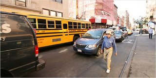
Bleecker Street
BORDER WAR Mr. Kent would ban cars on Bleecker and give pedestrians, like this one, free rein.
When Mr. Kent pulled his bike over to look at the western entrance to Bleecker Street, he was nearly hit by a cab tearing around the bend. Two lines of Hudson Street traffic funnel around a curve into Bleecker’s one lane, and the choke point is next to a park and a playground.
“That’s no way to enter a neighborhood,” Mr. Kent said, shaking his head.
Public space, he added, is more than parks and plazas: “It’s the entire ground floor of a city — everything that’s not office or residence.”
In Mr. Kent’s opinion, streets and sidewalks should therefore be designed for the public good. Instead, he complained, they are designed primarily for high-volume, high-speed traffic.
If Mr. Kent had his druthers, Bleecker Street would have no cars at all, parked or otherwise, and cafes and shops would spill out onto the sidewalks. This may not be a farfetched idea. One of the planks in the mayor’s 25-year growth and environmental plan, unveiled in April, calls for a “pedestrian street” in each of New York’s 59 community districts.
Short of a ban, Mr. Kent would replace the traffic lights with a stop sign on every corner, bringing cars into a slow rolling rhythm more appropriate to a street with so much foot traffic. Most traffic-calming advocates believe that people aren’t safe or comfortable on streets with cars traveling faster than 20-25 miles per hour, yet many city traffic lights are timed for cars going at least 38 m.p.h.
Traffic problems, Mr. Kent says, are more easily remedied than you’d think, and not just because New York has a robust public transportation system and a low percentage of car ownership. “It’s actually very simple,” he said. “When you design for cars and traffic, you get more cars and traffic. When you design for places and people, you get places and people.”

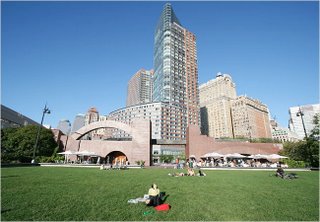
Battery Park City
KEEP OFF Mr. Kent’s reading of this pristine park: “It lacks the chaos of human evolution that would make it a truly great place.”
“Design,” Mr. Kent said, “is a disease. It is almost always at odds with good places.” And design, in his opinion, is what has ruined a potentially extraordinary place, the waterfront parks of Battery Park City.
Hailed as a triumph, favored with multiple design awards and imitated around the world, Battery Park City’s shiny new waterfront is one of Mr. Kent’s least favorite public places in New York. “It’s a mishmash of stuff that doesn’t fulfill human needs,” he said.
For an hour close to lunchtime, he watched as dozens of people walked right up to the 5,000-square-foot rectangle of pristine grass that is the centerpiece of Robert F. Wagner Jr. Park, the waterfront’s south entrance. Not a single person walked onto the grass during that time. Because no path leads to the other side, the lawn serves as obstacle rather than welcome mat.
“The design says, ‘This area’s more important than you are,’” Mr. Kent said. “And they designed it to be finished at the ribbon-cutting ceremony, so it can’t evolve. It lacks the chaos of human evolution that would make it a truly great place.”
As he wound his way north, he encountered other obstacles, in the form of elaborate plantings and sculptures. The flowers are undeniably lovely, but they often block sight lines to the water. Besides, Mr. Kent complained, most of the buildings that front the parks offer nothing but dead, blank walls or dark, forbidding arcades that obscure the few restaurants within.
What he finds particularly irksome is that apart from the waterfront itself, two good destinations are located here, the Skyscraper Museum and the Museum of Jewish Heritage, whose entrances seem deliberately hidden.
“Good public spaces,” Mr. Kent said, “should reach out like an octopus.”
He is certain that the community itself would have come up with a better design for Battery Park. His strategy is to go directly to a community and then translate those ideas and wishes into marching orders for designers. “It’s magical, how people know what to do with a place,” he said.
Impresario of the Village Green
By ELIZABETH GIDDENS with photos by Julien Jourdes
The New York TimesSeptember 30, 2007
UP WITH PEOPLE “It’s magical, how people know what to do with a place,” says Fred Kent, arranging figures in a French model circus.
AMONG Fred Kent’s one million photographs of cities around the world, there is a set filed under the title “Affection.” There, in the most public of places, on benches, fountains, ledges and steps, urbanites are captured in various stages of embrace. Elderly couples lean against each other; mothers press their children to their chests; young lovers lie with coltish intertwined limbs.
It is beautiful, innocent voyeurism. And it is the crux of Mr. Kent’s work. “When a place makes people really happy, really comfortable,” he said, “they start touching each other.”
He should know. An affable, boyish native of Andover, Mass., Mr. Kent, 64, is an urban anthropologist and space doctor, and as founder of the Project for Public Spaces, a 32-year-old nonprofit group with offices near Washington Square Park, he spends his days observing homo sapiens in one of its favorite habitats: cities.
Mr. Kent learned his trade from the anthropologist Margaret Mead and the urbanist William H. Whyte, affectionately known as Holly, and he assisted Whyte with the research that culminated in his remarkable 1980 book, “The Social Life of Small Urban Spaces.”
The two men studied the different ways men and women use public spaces (men cluster around entrances; women are more particular about the places they frequent), the strange rites of girl-watching and the spots where couples are likeliest to kiss (in locations more prominent than private). They also outlined the “three-phase goodbye,” and they discovered that pedestrians give wider berth to a woman in makeup and a dress than to the same woman in a ponytail and sweats.
Running through all their findings was a simple and elegant thread: People like to be around other people. That axiom and the “placemaking” philosophy Mr. Kent developed are explored in “The Great Neighborhood Book,” published in June and written by Jay Walljasper, a senior fellow at Project for Public Spaces.
Mr. Kent has his critics. Designers often charge that his socially centered approach ignores form in favor of function, and his outspokenness frequently prompts complaints — like the charge of “born-again zealousness” levied against him in a recent magazine article by the landscape architect Laurie Olin.
But few would disagree that Mr. Kent is a force to be reckoned with. Shortly after the publication of “The Great Neighborhood Book,” Mr. Kent spent a couple of days visiting some familiar public places with a reporter, appraising them according to the principles he has spent so many years formulating.


<< Home